

Xiomega
Branding / Identity / Packaging
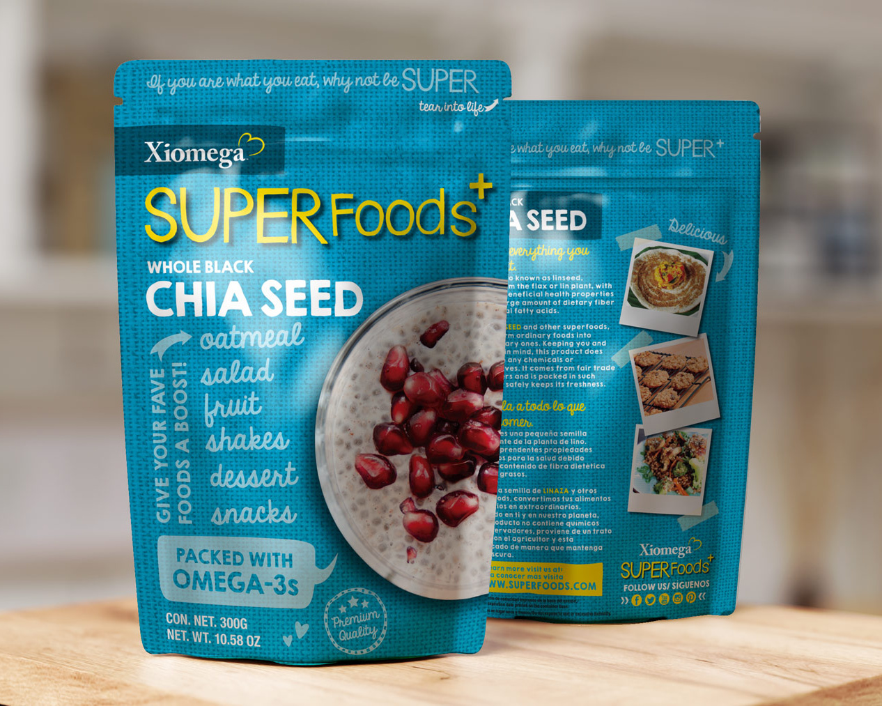
A leader in superfood category, Xiomega was introducing their products to the U.S. market and needed to elevate their offerings from mere ingredients to a lifestyle choice. We developed an energetic brand that could flex across multiple product categories.


Powerful DNA of Superfoods
An aggressive sales strategy meant the design look and feel had to be flexible across many categories. So we developed a core group of colors, typography and layout that could be interchangeable based on the product category. The result was a brand architecture that was immediately recognizable as Xiomega, but that allowed for category specific personality.


